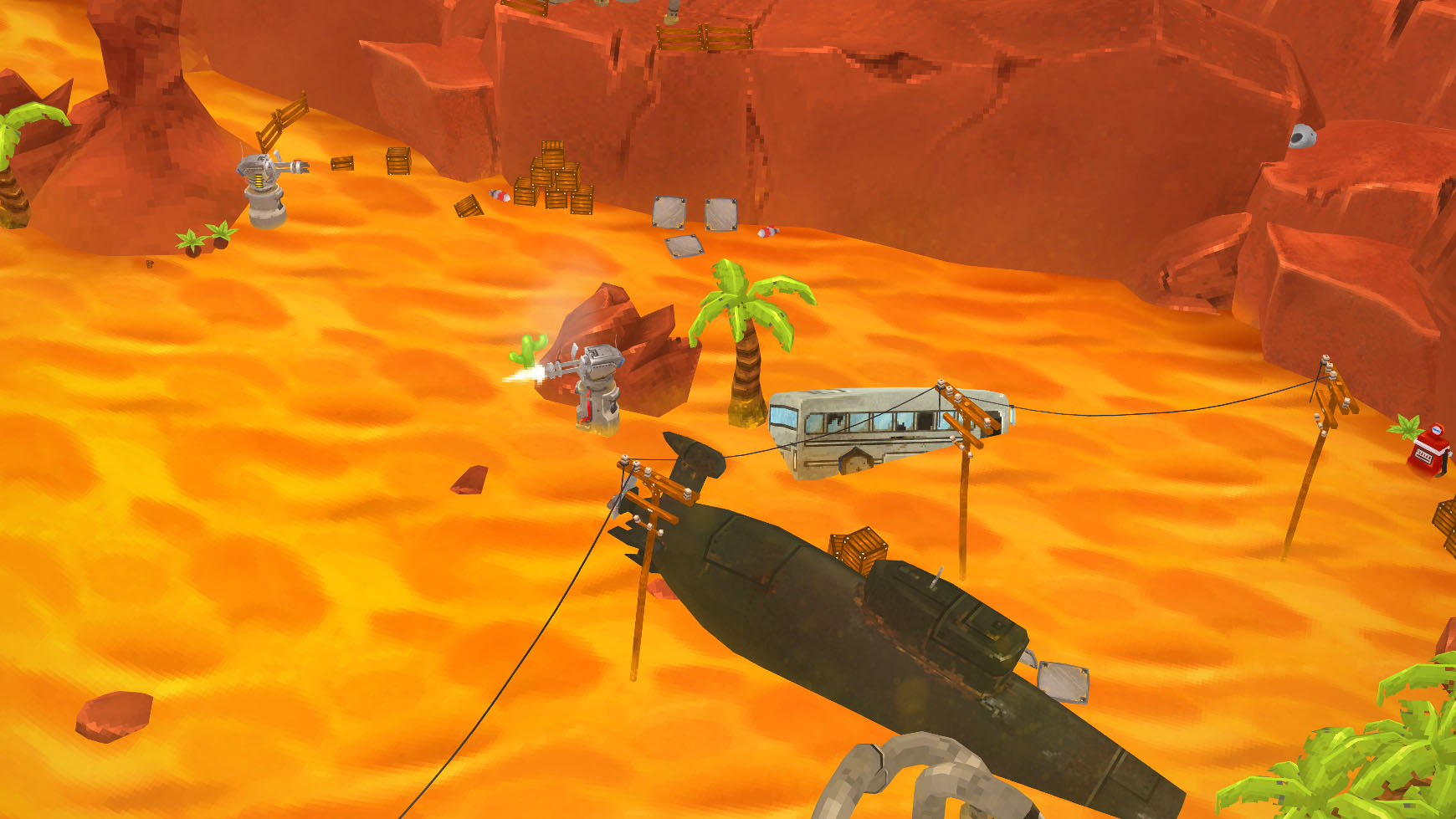
As we started development on our new game, we spent about a week preparing a visual image to strive towards with the game. These are pretty common practise in game development and they’re often pretty polished videos, used in pitching and conceptualization. These are usually called target renders. For our use just a static image that looks like it could be gameplay. Having one helps everyone get motivated to start work and you’ll even end up with a handful of assets that can be used when making an initial playable prototype. At their most simple they can even just be a layered photoshop drawing. The target render for what would later turn into GunTruck was a mix of 3D and some 2D. You’ll find the finalized target render in the previous blog post.

Some stuff was modeled from scratch and parts of some elements were repurposed from old subcontracting models and personal projects. The ground was a high-poly sculpt with tire tracks done with geometry instead of plain textures. The rocks were quick and dirty sculpts as well. I think I did most of the environment texturing as quick and dirty camera projection unwraps because I wasn’t planning on spinning the camera around or doing a video with the scene. The lighting was simple with a directional sun lamp and some secondary lights to help it out. The rest was just composing the scene, compositing effects on top and finally doing a final pass in Photoshop.
Then there’s the first gameplay prototype made by our super talented intern Antti. This let us have a first hands-on with the game concept of simple two-button controls and a turret that aims as well as shoots automatically. It served its purpose really well, but for obvious reasons not a huge amount of effort was put into elaborate custom assets. The ground was done with the Unity terrain tool, so it really wasn’t even mobile optimized. It’s just interesting to see how the project looked in the beginning.

The first gameplay prototype

Some early miscellanious concept sketches from… 2015!?
Our initial vision turned out to be a bit grandiose for small mobile screens, so we started work on a style more suited for small devices. Also, because iteration is such an important part of how we do things and this being our first own fully 3d game, we wanted to make the assets relatively quick and cheap to produce. Here’s a pretty early scene mocked up with the more mobile-friendly and optimized assets…

A lot of stuff has changed since, but the PS1-ish large texel, low-poly look has remained. The unlit textures and baked-in asset shading was mostly inspired by how MegaMan Legends looks on the PS1. It’s a look that still reads really well, since it’s all down to how the assets are colored and textured. The current build has a static lightmap (with lightprobes in the high graphics setting), but we’re still experimenting how we want things to look when all is said and done.
There are hundreds of old concept drawings and renderings that have never seen the light of day, so it might be fun to round up a bunch of them. Some of them might even be kind of interesting to dissect.


